Chamille: Welcome, one and all, to another Age of Empires Community Highlights and Fan Creations! It’s been some time since we’ve visited the impressive talents that our community has worked day and night to establish, and we’re excited to present these amazing pieces to all of you today!
Before we get started, I’ve asked our Art Director at World’s Edge to join me today in talking about this fan art and why it’s important: please welcome Han Randhawa! Han has been with the Age of Empires team for just under 4 years and has worked closely with the current Definitive Editions of the games, including the highly anticipated Age of Empires III: Definitive Edition and Age of Empires IV! His work as an art director has spanned more than 20 years in the industry, and he continues to help budding artists while also upholding the beautiful styles we’ve come to love and enjoy of the Age of Empires franchise!
Han, thank you for joining me today in reviewing these pieces created by our fans! Could you tell us a bit more about why you think fan art is important?
Han: Absolutely! First off, I started my career doing fan art. While I was taking notes in school, about 25% of it was actual work while the other 75% was just fan creations of things I loved. I was passionate about video games and comic book superheros, and that passion lead me to continuing my sketches. Subconsciously, through this repetition of expressing yourself, you start to break down and reverse engineer the artwork you make. It turns into a learning process, which can then lift you into a potential career while also giving you an important way to cherish the things you enjoy!
Fan art is also super important to the development team: I feel it is a two-way communication between us and the player base. As stated earlier, when you are passionate about something you love, you want to express it in some way. For fan art, that enthusiasm to the franchise really means a lot to the developers and continues our own dedication of the game. We really want to do more when we see that kind of passion! So really, fan art opens up learning outlets and future careers possibilities, while also giving life and movement to the franchise you love.
Chamille: I absolutely agree, thank you for your words, Han! Without further ado, let’s review these fan art pieces today!
Shotel Warrior by teoMouse
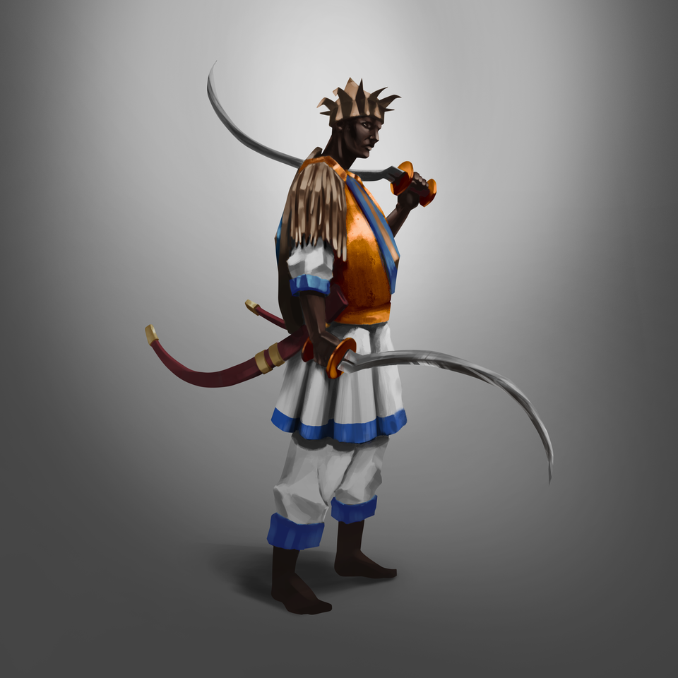
Chamille: First up, we have teoMouse with this Shotel Warrior digital painting. The shapes and shade are magnificent as well as the details into the blade and hilt. The soft blend background gives a great contrast to the figure’s pose! Just look at the shade cast from the hard overhead light onto his head armor and how how it diffuses down his face. The textured brush on the body armor gives a metallic look as well, compared to the smooth cloth underneath. Absolutely spot on capturing the Shotel Warrior Unit from Age of Empires II: The African Kingdoms perfectly!
Han: When you first showed me this, I was like “This is so cool!”. I’m so happy someone has done fan art of the African Kingdoms unique units as well, the detail here is astonishing! We usually see such small models in game, it’s refreshing to view all of this up close: the difference in metal and cloth, the complimentary colors chosen of the orange and blue contrasting with the white of the cloth, it’s extremely well observed. His posture holds a lot of purpose and meaning, too! I especially love the shape of the blades and hilt and how it creates a flow to the piece and compliments his stance. Wonderful work!
Follow teoMouse:
Unique Units by Hiyokocta99
Chamille: I absolutely love these unique units details! Each character has all of their design displayed with so little to work from, it’s extremely appealing! Also, notice how most of the outline is solid save for a few specific areas, such as the shine of the metal, or for the feather of the knights hat and around his shield. It weighs down each edge in a solid manner, but is occasionally broken up to give extra pixel space when needed to create the desired effect. Wonderful work!
Han: I get all misty-eyed when I see art like this, as I started off on an Amiga 3000 doing pixel work! That’s how I first cut my teeth in the industry before we went to 3D. That being said, I absolutely love the persona they each have and the clarity of the individual weapons. Especially the minor details, like the middle unit’s right foot: You have only one or two pixel to define the big toe, thus giving us just enough information for where the weight in his leg is. It’s wonderful, you have such a great sense of light and shade!
Follow Hiyokocta99
Medieval by GrDreamer
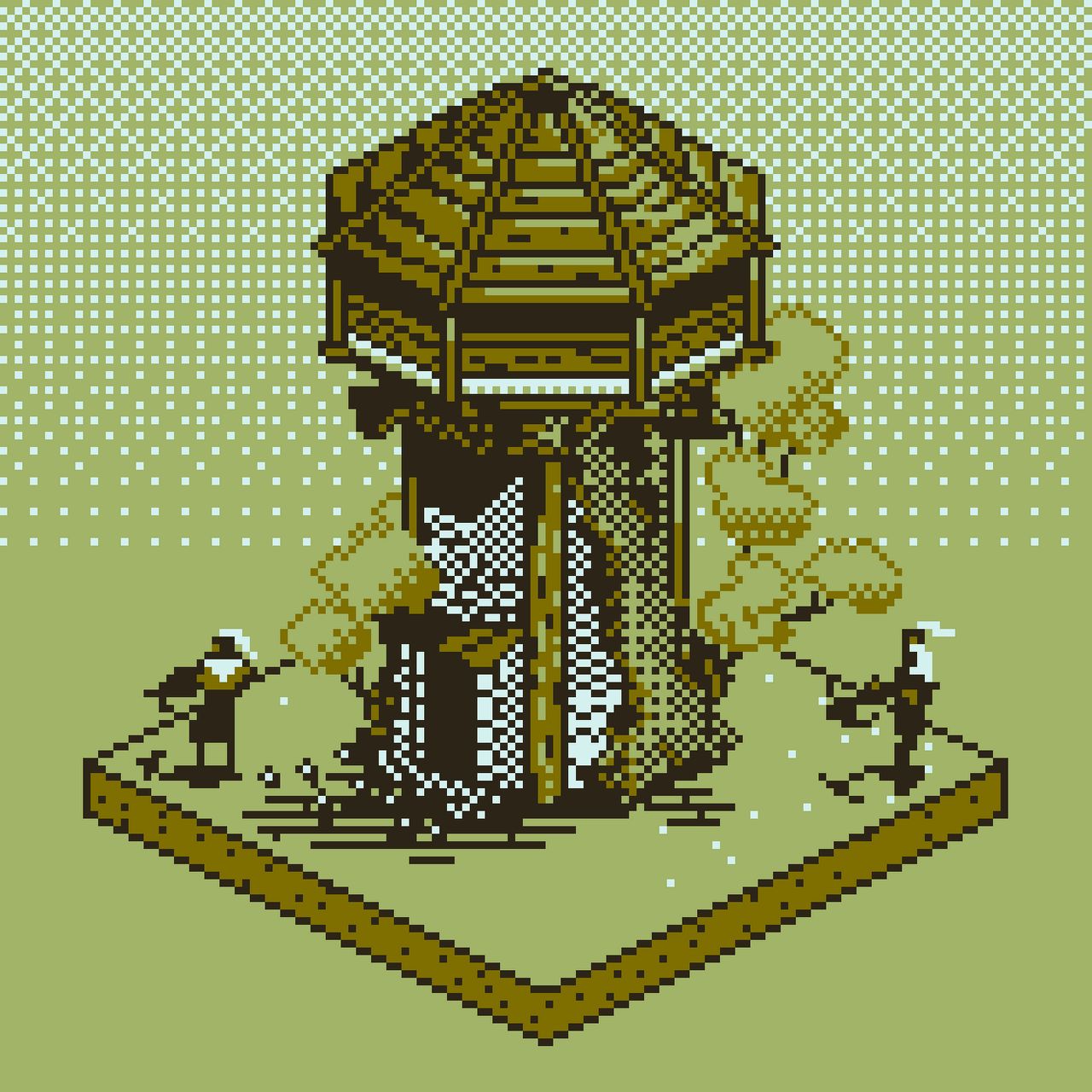
Chamille: Once again we see another pixel art using it’s limited resources to create fantastic details! The use of the 8-bit, GBA limited monochrome-style color scheme makes this super interesting to me. I can’t believe how so few pixels translates to knowing there is crossbowmen guarding diligently. I especially love the gradient creation of the background and the trees covering our beloved little tower, too!
Han: This reminds me a lot of the graphics for my old Commodore 64! Using a limited color pallet is both fantastic and challenging. You really have to work hard to separate all the elements, but of course, you did that extremely well here! These pixels are being used to the maximum by utilizing gradations in the background and trees. The wood planks of the roof have a detailing light source that helps this tower really pop out from the background. Very solid work GrDreamer, well done!
Follow GrDreamer
Teutonic Knight by Templarpt1993
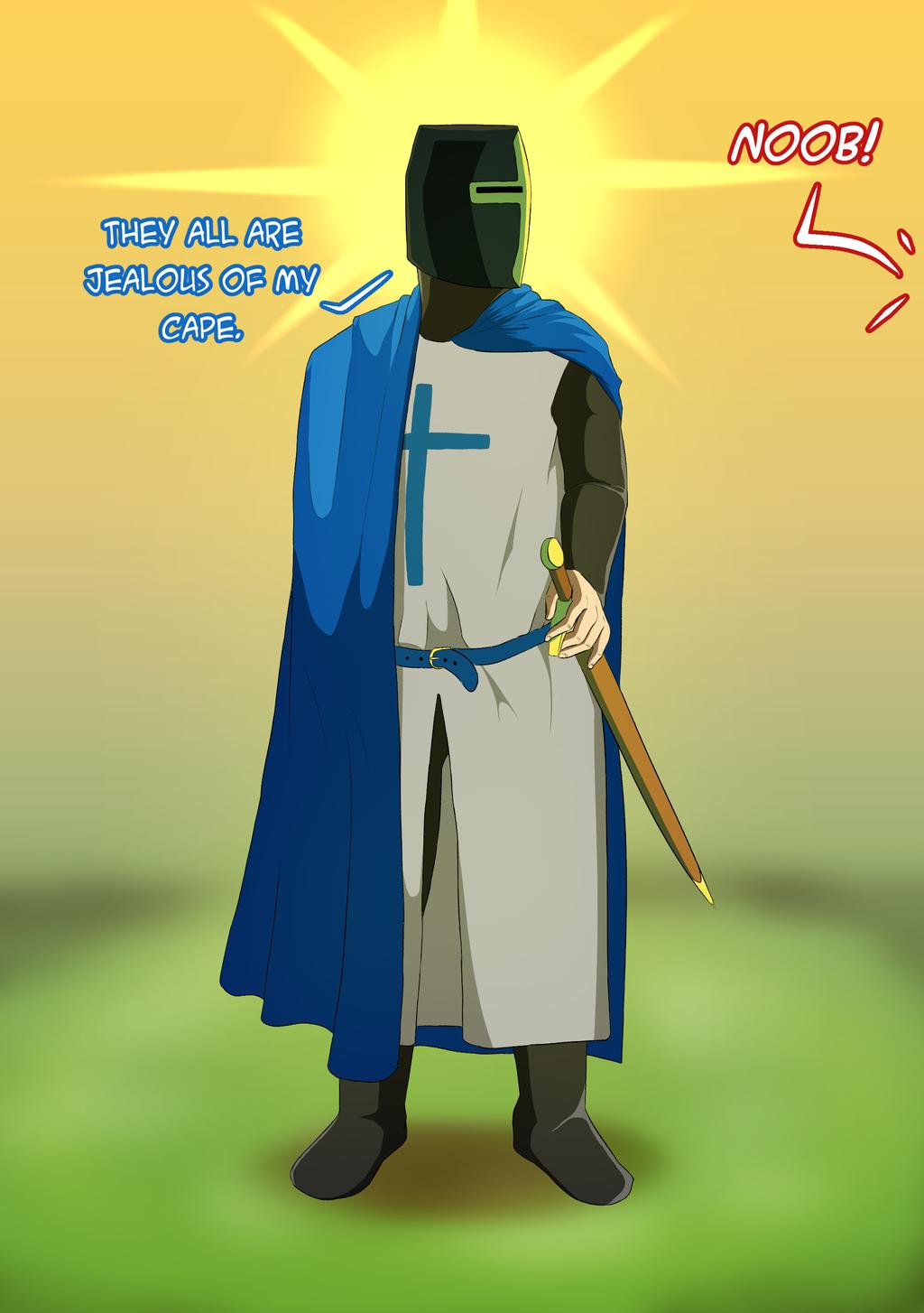
Chamille: This digital art by Templarpt1993 made me laugh and I’m sure many of you in the community can relate. I’m jealous of his cape too, with him having his speed increased recently to 0.8, it now flaps even more majestically in the wind! I really love the lighting and color choices. Having the golden yellow fade into the green, and the highlights off of his helmet down to his boots is wonderful!
Han: This is really great use of cell shading! The transition of the cape is based on three solid blocks of color, yet it still holds the subjects shape. My favorite part is his pose, he looks ready to fight while reaching for his sword as a defense mechanism— Likely from the other team calling him a “noob”? The soft background colors also makes the character pop off the page, while still emphasizing the Teutonic Knight basking in his own “awesomeness”.
Follow Templarpt1993
Low Poly House by Jches16
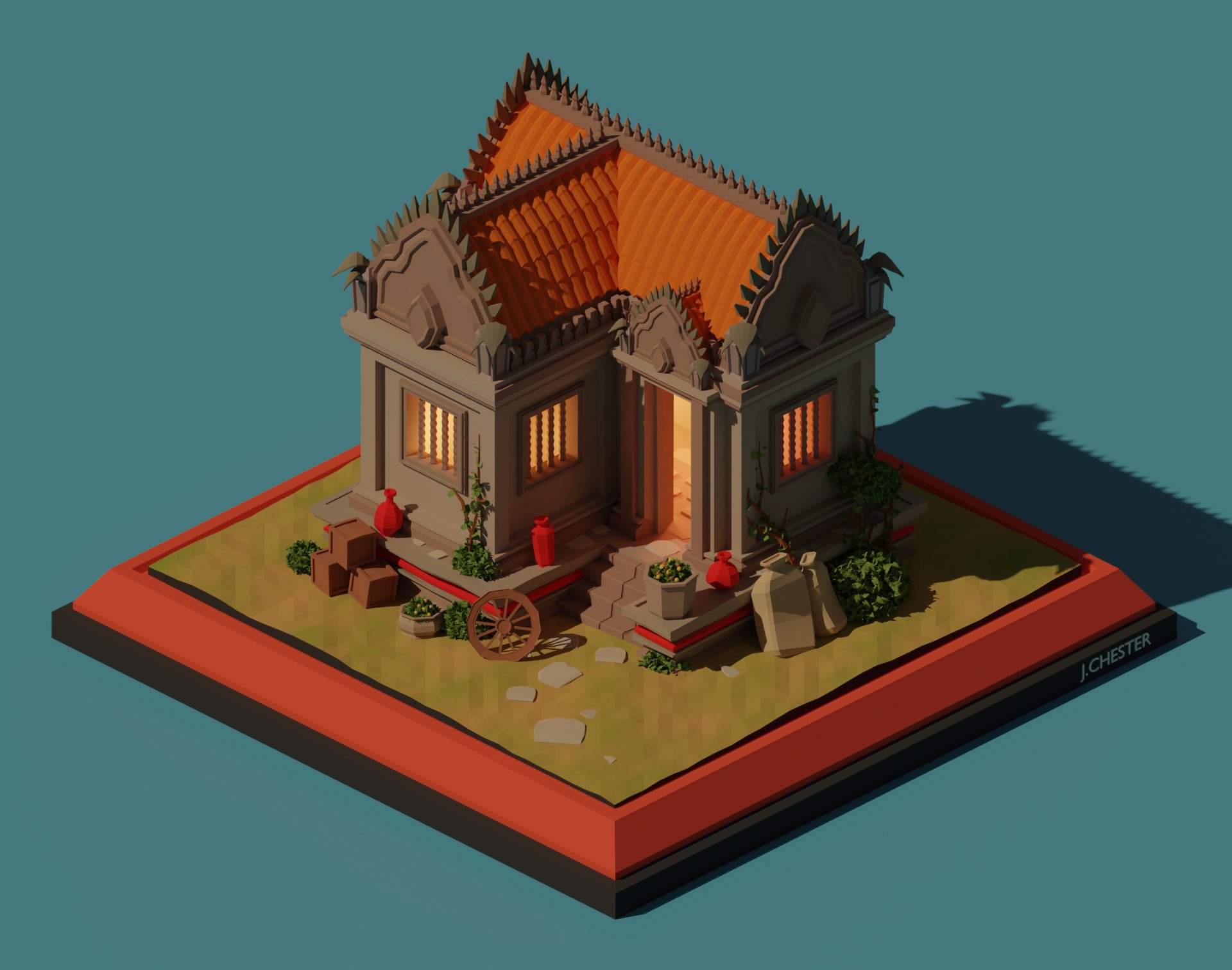
Chamille: I was lucky enough to catch the creation of this live on jches16’s stream! It was a fantastic display of craftsmanship and use of blender. Seeing their work bloom from the start of a simple sketch to the eventual final render was amazing. Look at the soft gradients in the house, the roof details, even the use of shape in the grass. It’s all so simple, yet so pleasing! I absolutely adore this piece.
Han: This is amazing, the detail here is exquisite! The tiles on the roof, the little bits of shrubbery and packages around the house, the cartwheel dipping ever so slightly into the ground to add weight, it’s all wonderful to look at. I love the warm gradient light coming out of the house, because while we were making the assets with Forgotten Empires, we had the lights added to make it feel like someone lived there. If you watch closely in the destruction animation, the lights flicker just before they are extinguished and the building collapses. It’s a minor addition, but it really shows the artists attention to minuscule details!
Follow jches16
AoE2 Meets Planet Zoo by Rmorley1985
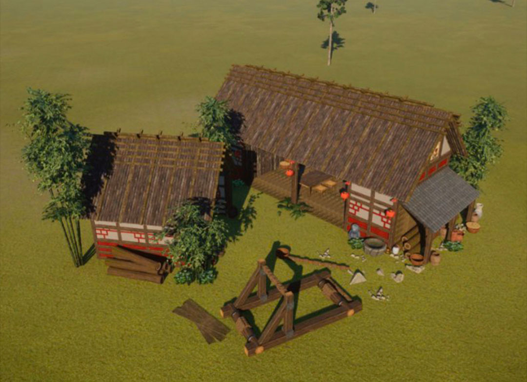
Chamille: Rmorley has been showing a lot of his work in progress in these fan creations on Planet Zoo. The recreation of these Age of Empires II buildings is extremely elaborate and doubles as a functioning structure for the game’s park visitor and animals, too! I find this extremely unique because it’s fan art inside ANOTHER GAME! We’ve seen some of this before with sandbox-like games such as Minecraft and The Sims. I love seeing the tools people are given and turning it into tangible works of art, no matter the medium!
Han: Like you, I love that it’s a game within a game! Rmorley did a great job using the tools available to him to recreate this piece. It’s very authentic! Even down to the details on the side of the building and the addition of environment, it really helps to soften some of the edges. To me, it’s like building with Legos— being able to create something like this. It’s so good!
Follow Rmorley1985
Unique Units by Juan Allendep
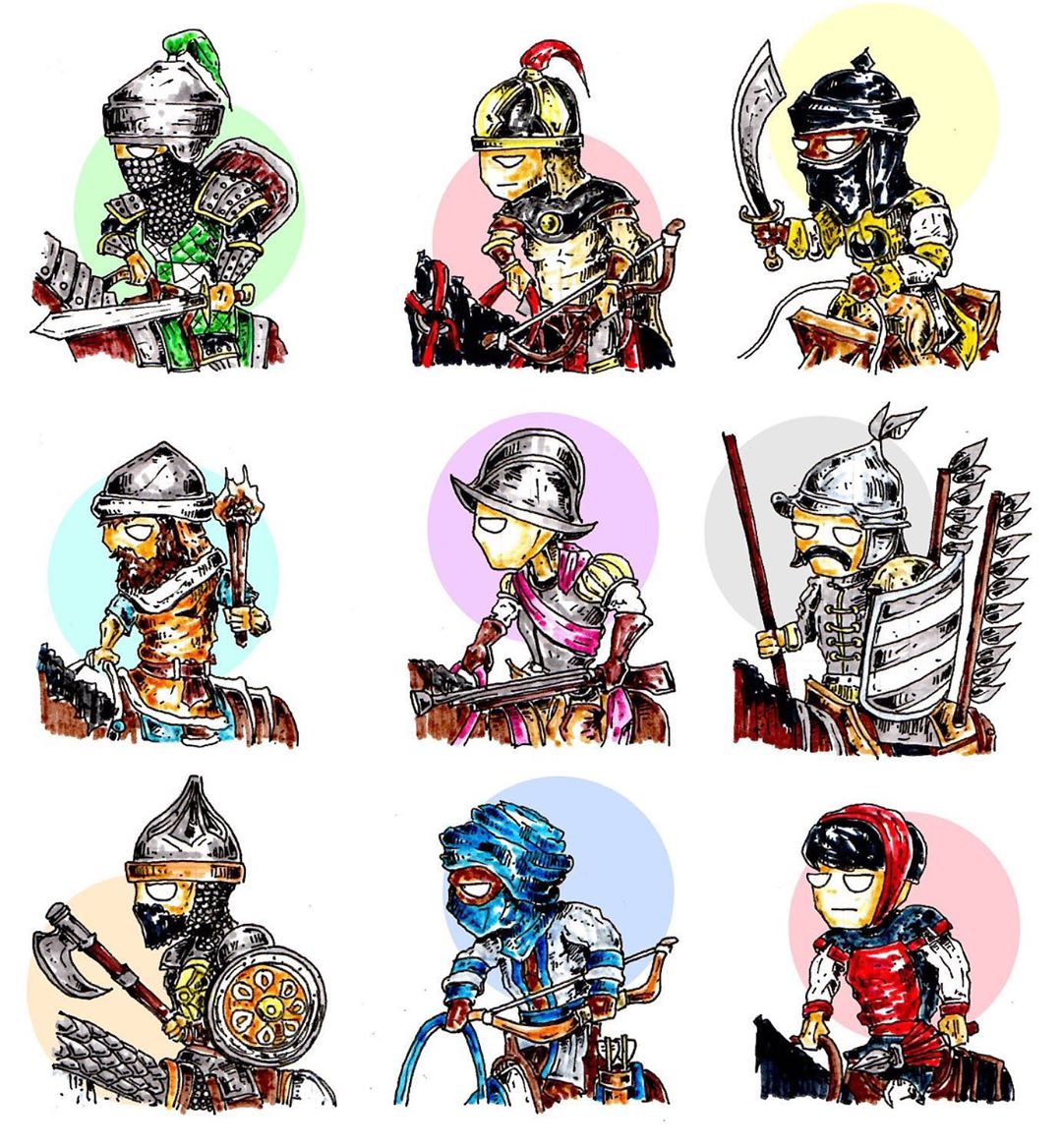
Chamille: Check out the impressive, unique style going on here! Just because Age of Empires has an established realistic style doesn’t mean people can’t draw it with their own flare! Juan’s unique perspective of these units is both captivating and also very fun! I love how well the line work meshes with the marker’s color use. The cross hatch shading of the ink gives each character a nice texture appearance. I love all the delicate details depicted too, so you know each unique unit just by a quick glance!
Han: The felt tips and microns used in this piece is excellent, there’s a lot of work gone into each of these units! Everything from the chain-mail down to the bolts and rivets in the armor and weaponry is so intricate. Honestly, I feel like this would do great as it’s own entity or game! There’s such consistency of style with each one, it works so incredibly well together. Fantastic!
Follow Juan_Allendep
Happy Fathers Day by toothparste
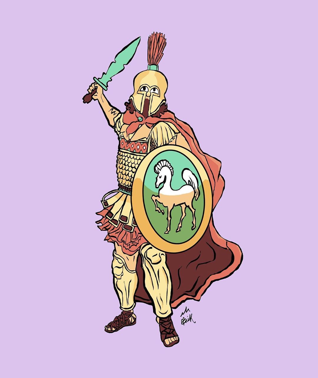
Chamille: Wonderful, more Age of Empires: Definitive Edition art! I really love the line weight happening here, it shows a ton of character from the artist! The simplicity of all of the colors and shading are very interesting as well, you know exactly what you’re looking at with a simple glance! It feels a lot like a traditional comic style and I really enjoy it! Not only that, but this is a sweet Father’s Day present from toothparste!
Han: This is honestly a style I really admire, I’m a big fan of heavier line weight use in comic books. The Age of Empires Spartan is extremely iconic and you captured that incredibly well! His helmet, pose, and all his detailed armor pieces really come together in your style. I also very much enjoy the little bits of shading, especially around the shield. It gives a impressive sense of depth with such a simple addition. I hope whoever received this liked it a lot!
Follow toothparste
Fan Animation by Jose
Chamille: This is SO cool! Motion graphic animation is a tough job to do and this is executed brilliantly! They not only had to collect and animate all the art from Age of Empires, but cut out each piece, put it on a rig separately, add in effects, test timing, render, add masks to make lighting work, pushing 2D assets to be in a 3D space… the list goes on! This style of work is actually quite popular; you can even see in the opening animation for Age of Empires II: Definitive Edition!
Han: Oh wow, I’m enthralled with this, there’s a real art to motion graphics! It’s pays true homage to the original great work that exists and now has morphed into the fandom as a brand new piece of work. The narrative being told here by flying through the imagery, over the swords and into the battle field is incredibly interesting. I really enjoy the custom title cards created here, too!
Follow Jose
Thank you!
If you loved the fan art you’ve seen today, leave a comment below about what piece was your favorite! Also, make sure to take some time and follow the creators and give them a thumbs up for their time well spent! We absolutely enjoy every single piece we see on reddit, the forums, and socials channels. Thank you, all of you, for your time and effort into each and everyone one of these pieces! We cannot wait to see what comes next.
If you have fan art you want to share with us, please tag us on our social channels! Thank you again, everyone, have a lovely and safe day!
— The Age of Empires Team