The Age of Empires III: Definitive Edition launch is just days away! Ahead of the October 15th release date, we’re here to dive into the all new, completely overhauled and updated UI options that Age of Empires III: Definitive Edition has to offer!
Both new and veteran players of Age will appreciate the option to select from distinct HUD layouts based on their preferences. After extensive feedback from our community, we landed on three HUD layouts that will be familiar and welcoming.
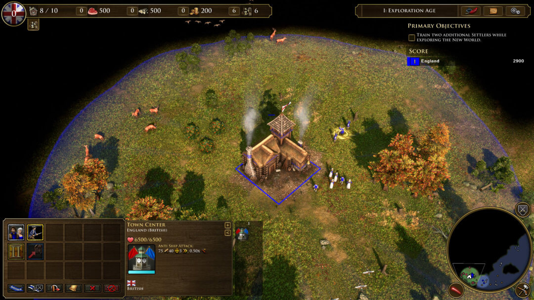
The Definitive HUD
The Definitive HUD closely resembles what fans of previous Definitive Editions are used to: with the mini-map on the bottom-right and the resources along the top of the screen.

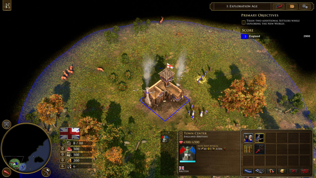
The Classic HUD
Not just a clever name, the Classic HUD closely resembles the original layout of the classic Age of Empires III: with the mini-map on the bottom left and resources adjacent.

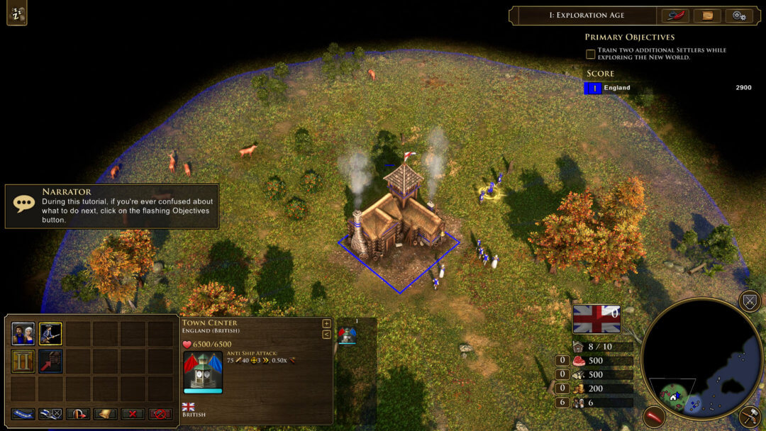
The Default HUD
The Default HUD combines both the Definitive and Classic HUD layouts to provide a new, streamlined presentation with the mini-map on the bottom right and resources adjacent.

Built for You!
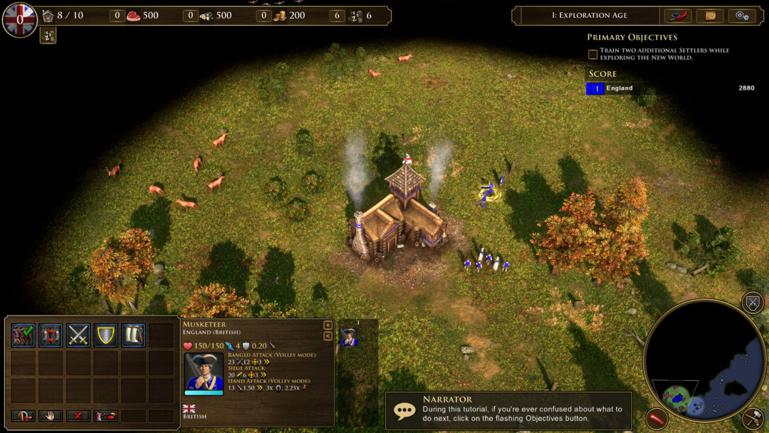
Veterans of the original Age of Empires III will immediately pick-up on the extensive work that went into designing the above options. The HUD is less obtrusive overall, appearing and disappearing as you select different units and buildings. Unit and building stat-blocks have been overhauled, presenting a clean, streamlined look. Stats are presented on one panel, with the player no longer needing to toggle between the Hammer / Paper icons to see unit stats. The HUD even offers scaling options in the settings menu!

These UI upgrades were made with usability and visibility in mind, allowing you to pick the look and feel that best fits your style of gameplay—whether you are a seasoned veteran of Age of Empires III or joining in fresh with this new Definitive Edition. We invite you to experiment with each layout and let us know which you like best in the comments below.